
Driving conversions with early plan visibility
Introduced a new plan selection step during sign-up to drive upgrades early and encourage intentional trials.
Challenge
Until now, most users entered Postman through the Free plan or unknowingly landed on a trial. Plan information appeared after onboarding, and upgrade prompts felt like interruptions, not invitations. This led to:
Poor awareness of paid plan benefits
Missed upgrade opportunities
Unintentional trial usage with no clear CTA
Drop-offs when users hit soft limits later
We wanted to enable users to pick how they want to experience Postman even before they land in the app.
Results
After introducing the new plan selection step during sign-up, we tracked early adoption patterns, user actions, and support feedback. These signals showed promising engagement and stronger upgrade intent from day one.
6%
of teams who clicked “Upgrade” converted within 3 months
33%
opted into a 30-day trial
48%
invited teammates within 7 minutes of trial start
Research to understand the chaos
Our research spanned multiple sources:
Support tickets with questions like “What plan am I on?”
Onboarding analytics showing plan CTAs went unnoticed
User interviews where many were unaware Postman even had multiple plans
Competitive analysis
We looked at how other SaaS tools like Figma, Dropbox, Zapier, and HBO Max surfaced pricing and trials up front. Common themes we found.
Always show a Free plan option
Let users compare side-by-side
Emphasize value, not just cost
Make both "Try" and "Buy" equally visible

Goals
We defined our success with three experience goals:
Increase awareness of paid plans and their benefits
Encourage upgrades during onboarding itself
Let users intentionally opt in to a trial (not just fall into one)
Explorations and early concepts
All plans with individual CTAs
Users faced too much cognitive load and felt like an info dump
The Free plan stood out as the easiest option, defeating the goal
All plans with a shared CTA
Again, the Free plan card is the easy option
Trial messaging felt buried compared to Free’s simplicity
Internal feedback flagged the pricing toggle ("Pay annually") as overkill at this stage
People didn’t associate the radio with the next action button
Three plans without Enterprise
Visually simpler, but still centered too much attention on the Free plan
Lacked context about what users were choosing and why
Internal reviewers were confused about why this step existed
Paid-only plans (no Free)
Visually overwhelming due to competing CTA styles and highlight colors
Skipped over a critical decision: “Do I want Free, Trial, or Paid?”
Without Free visible, the experience felt pushy and lacked transparency
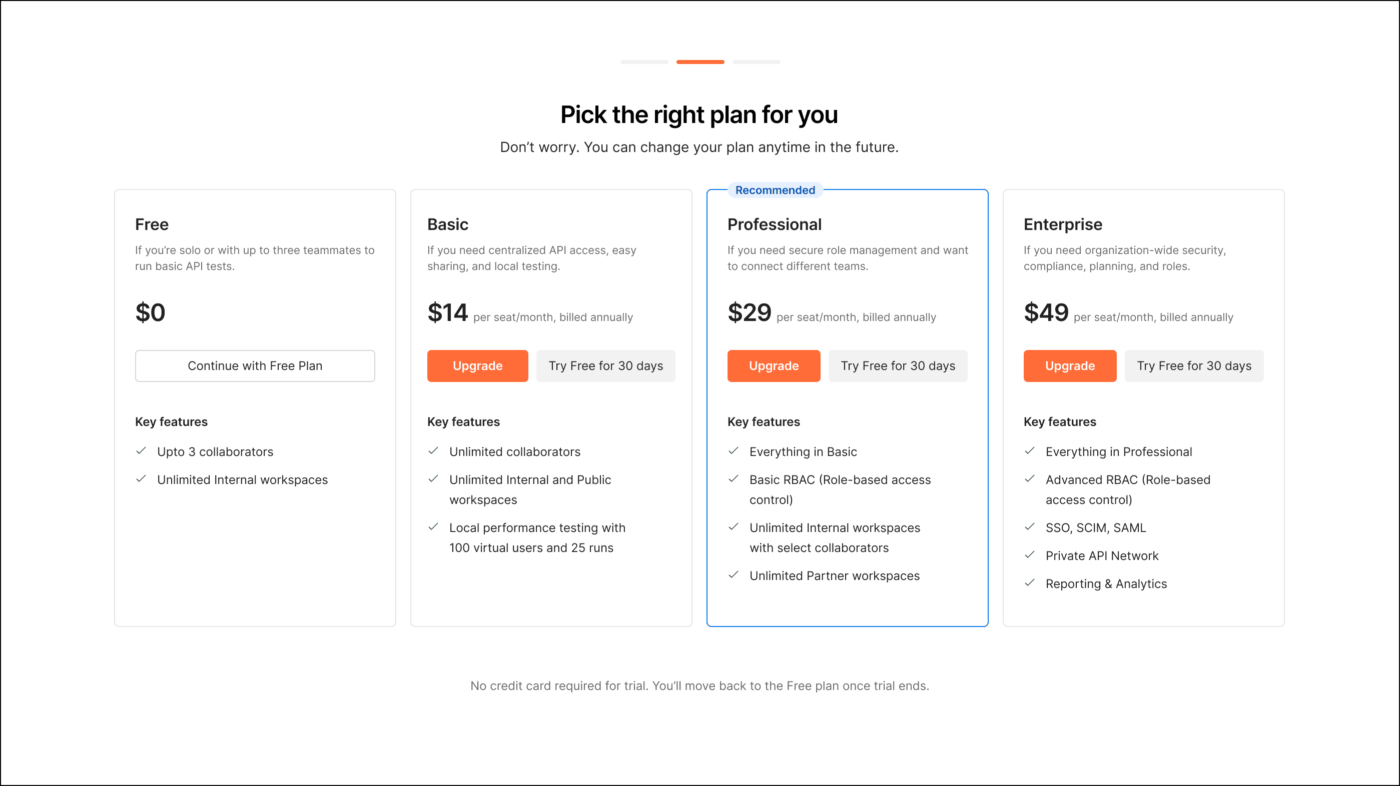
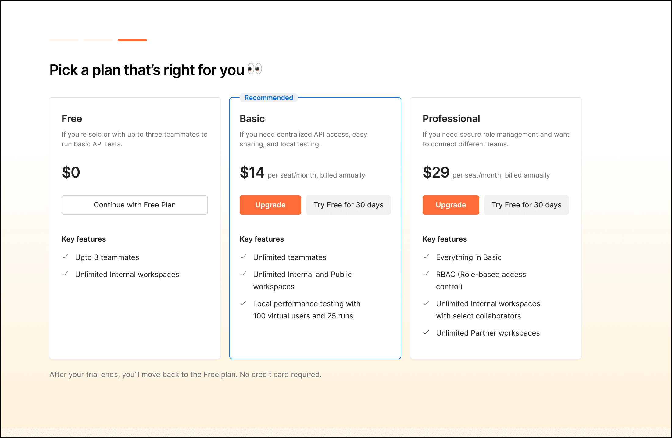
Final solution and experience
Plan picker appeared after team discovery to avoid disjointed team creation
Upgrade was the primary CTA, with trial as a secondary path
Free plan stayed visible but downplayed to encourage plan evaluation
Trial started with teammate invites to drive early collaboration
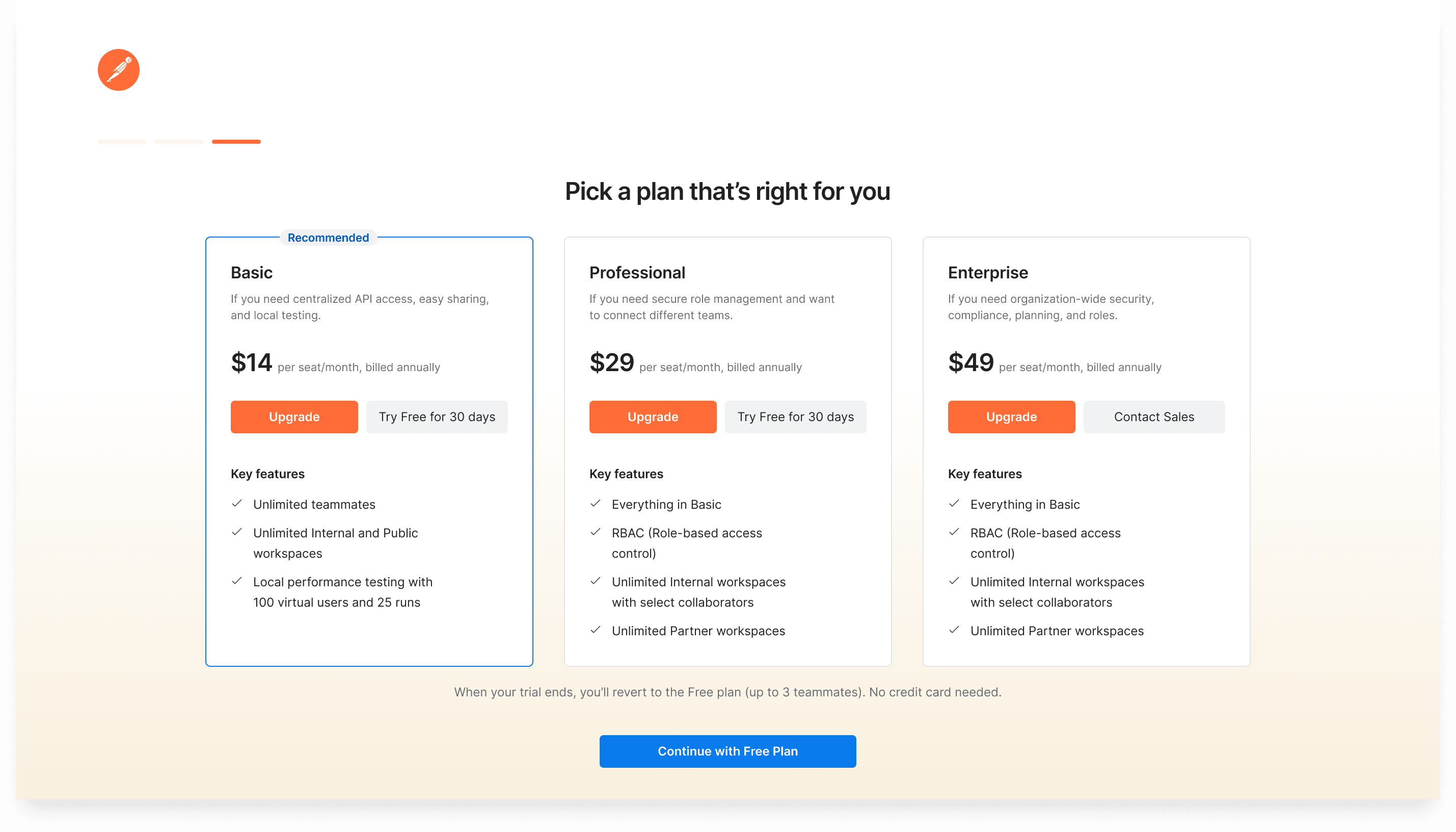
Upgrade-first by design
On the pricing screen, we led with “Upgrade” as the primary CTA for each plan
We designed the trial CTA as secondary. Still visible, but not dominant
The Free plan option was moved to the top-right, mirroring its placement in previous screens for familiarity and consistency
Better context through content
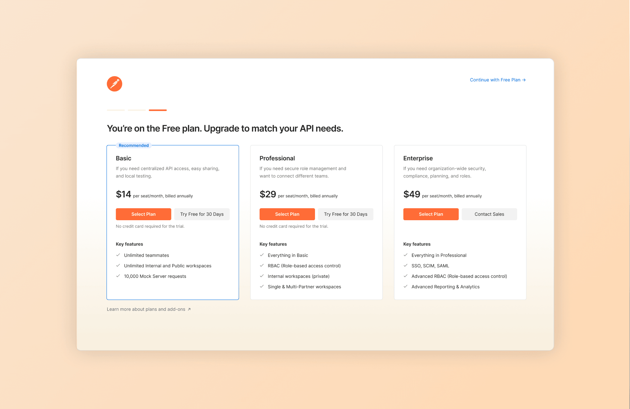
Started by clearly confirming that the user was on the Free plan
The CTA label “Select Plan” felt more inviting than “Upgrade” or “Buy.”
“No credit card needed” was placed right next to the trial CTA to build trust at the point of action
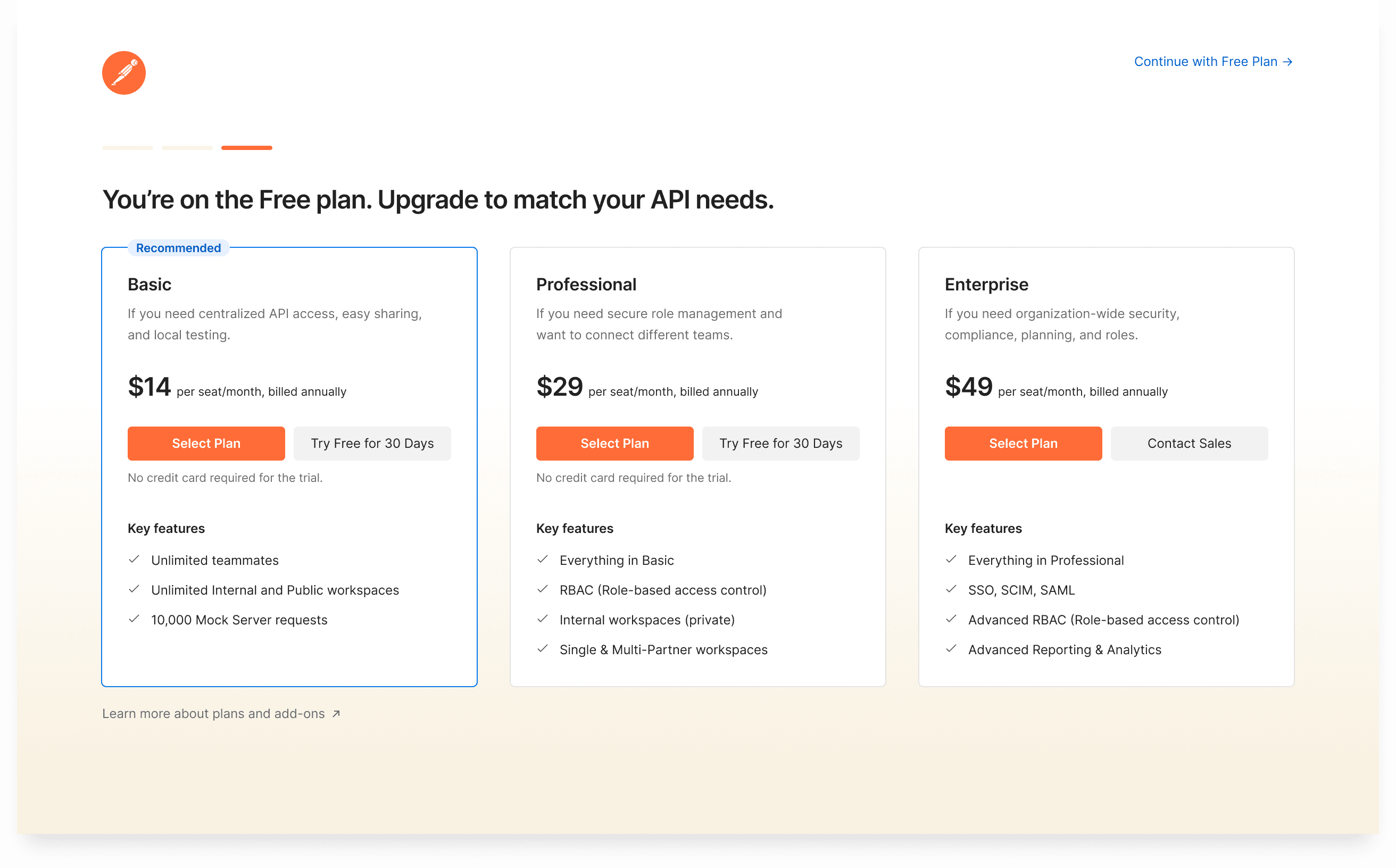
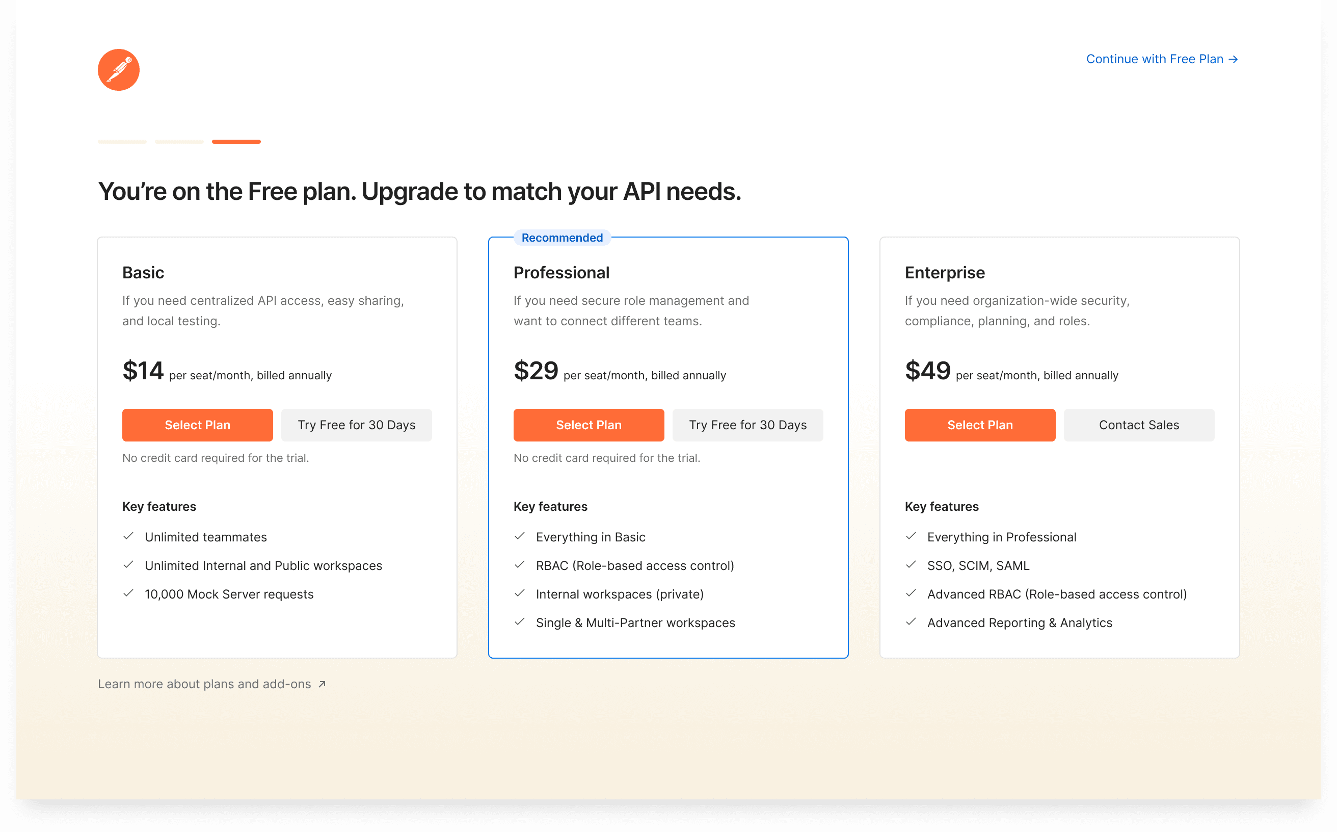
"Recommended" badge is contextual
The badge dynamically switches between Basic and Professional based on the user's email domain
Company domains see Professional highlighted, while public domains (like Gmail) see Basic
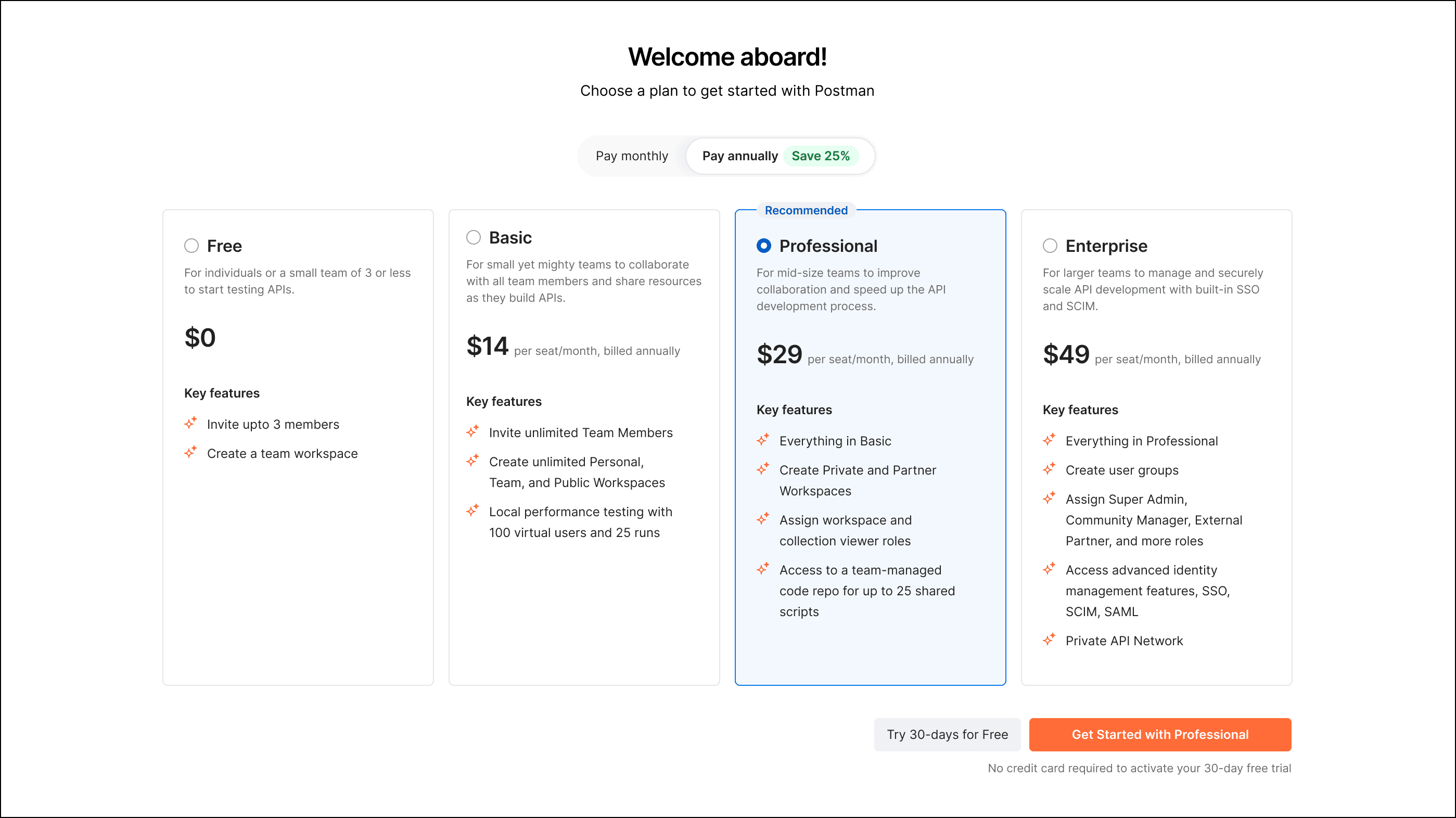
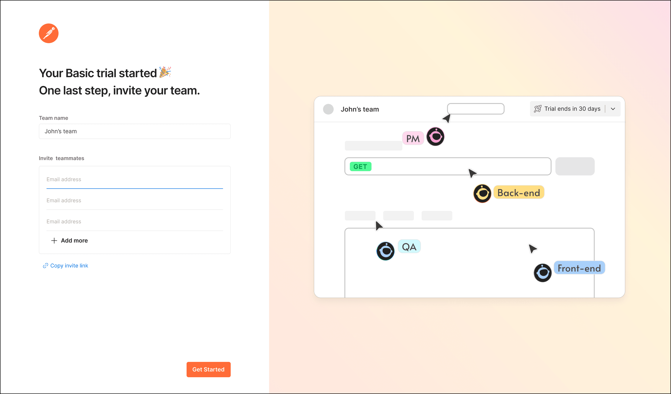
Trial starts with team invites
If a user picked “Try Free,” they didn’t just land on a dead-end confirmation. We showed a tailored trial start screen with:
Confirmation of the selected plan trial
A strong prompt to invite teammates right away
Moved users from intent to action right when interest was highest
Results
6% of teams who clicked “Upgrade” converted within 3 months
33% opted into a 30-day trial
48% invited teammates within 7 minutes of trial start